
Datadog Dashboards: Build, Template & Best Practices
Last Updated: July 2026 | 10 min read
Quick Answer: A Datadog dashboard is a page of widgets that visualizes your metrics, logs, and traces in one place. Build one from Dashboards → New Dashboard, add widgets (timeseries, top list, query value, table, heatmap) backed by metric queries, and — most importantly — add template variables like env and service so a single board re-scopes to any environment from a dropdown. Design top-down with the most important signals first, and manage dashboards as code with Terraform for version control.
Most teams have plenty of Datadog dashboards. What they don't have is dashboards anyone opens during an incident. The difference isn't more widgets — it's the right structure: template variables that make one board serve every service, a top-down layout that answers the first question fast, and ruthless focus. This guide shows how to build Datadog dashboards that earn their place: the two board types, how to create one, the widgets that matter, template variables (the feature that separates pros from beginners), best practices, and how to manage dashboards as code. If you haven't set up data collection yet, start by installing the Datadog Agent.
How Datadog dashboards work
A Datadog dashboard is a grid of widgets, each running a metric/log/trace query, with dashboard-level template variables that filter every widget at once. Understand that anatomy and everything else follows.
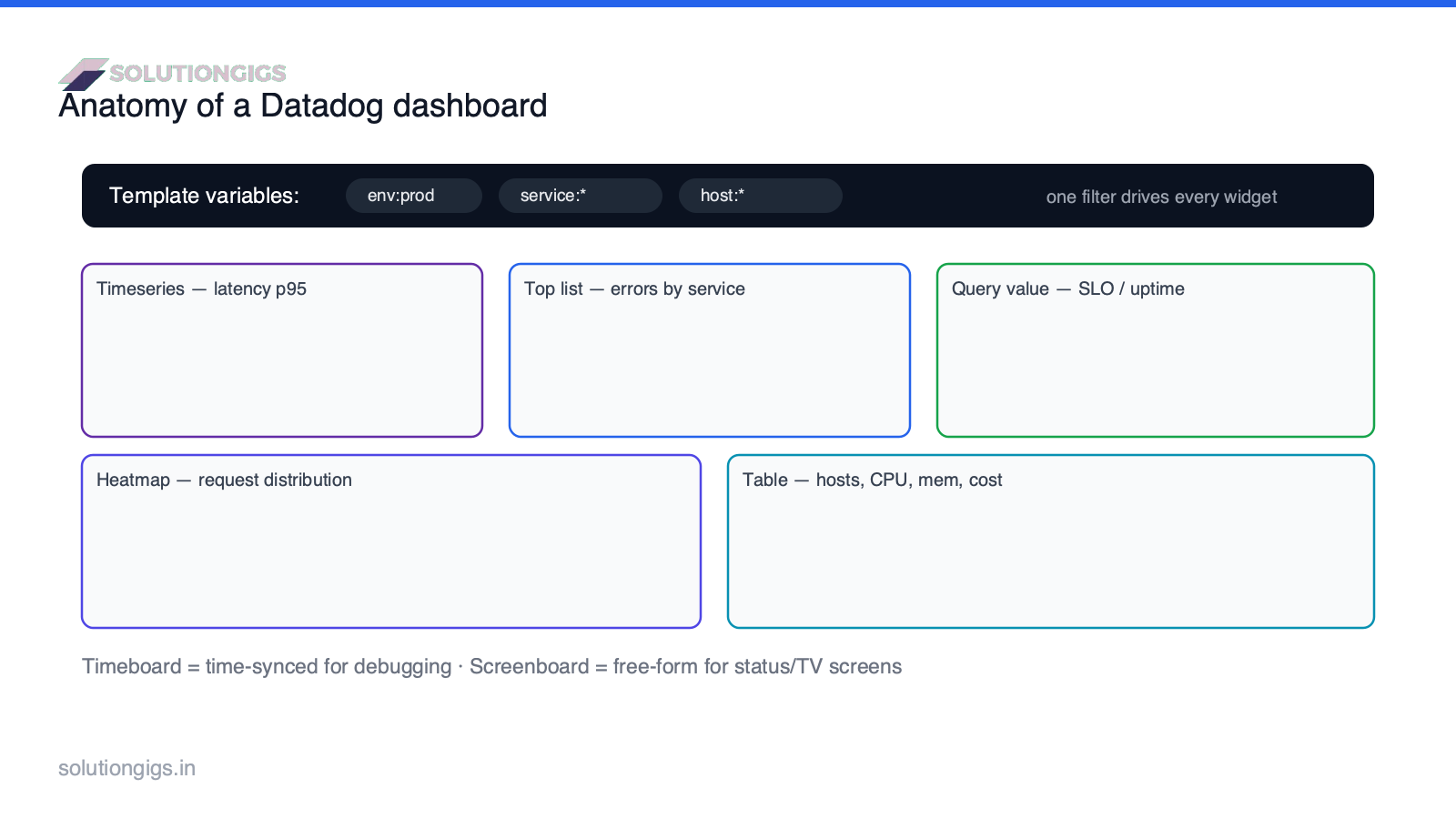
The three building blocks:
- Widgets — individual visualizations (a graph, a number, a table) driven by a query.
- Template variables — top-of-board filters (
env,service,host) applied to all widgets. - Layout — the arrangement that guides the eye from summary to detail.
Timeboard vs screenboard: which layout to use
Use a timeboard for debugging and a screenboard-style layout for status displays. Datadog has merged the two into one unified dashboard, but the design intent still matters.
- Timeboard — all widgets share one synchronized time range. When you zoom one graph, they all zoom. This time-correlation is what makes timeboards the right tool for troubleshooting — you can line up a latency spike against a deploy and a CPU jump instantly.
- Screenboard (free-form) — mixed time ranges, free placement, images, and annotations. Best for status pages, executive summaries, and TV/wall displays.
Rule of thumb: debugging board → timeboard; "is everything OK?" board → free-form.
How to create a Datadog dashboard (step by step)
Creating a dashboard takes a few minutes; making it reusable takes template variables. The workflow:
- New board. Dashboards → New Dashboard, give it a clear, specific name (
Payments API — Service Health, notDashboard 3). - Add a widget. Pick a visualization and write a metric query, e.g.
avg:trace.http.request.duration{env:$env,service:$service}. - Add template variables. Create
envandservicevariables so the whole board filters from a dropdown (note the$env/$servicein the query above). - Arrange top-down. Most important signals at the top-left, detail below.
- Save and share. Share read-only links, or embed on a status screen.
Datadog widget types (and when to use each)
Pick the widget that matches the question, not the one that looks impressive. The core set:
| Widget | Best for |
|---|---|
| Timeseries | Trends over time — latency, throughput, error rate |
| Query value | A single current number — SLO %, active users |
| Top list | Ranked offenders — top services by errors |
| Table | Multi-column comparison — hosts by CPU, memory, cost |
| Heatmap | Distribution across many series — per-host request spread |
| Change | What moved most vs a prior period |
| Service map / topology | Dependencies between services |
Template variables: the feature that separates pros from beginners
Template variables turn one dashboard into infinitely many by filtering every widget from a single dropdown — build once, reuse everywhere. This is the highest-leverage skill in Datadog dashboarding.
Without them, teams build Orders — Prod, Orders — Staging, Payments — Prod… and maintain dozens of near-duplicate boards. With a $env and $service variable, one board covers them all: change the dropdown, the entire board re-scopes. Reference the variable in queries as {env:$env}.
Pro tip: set sensible defaults (e.g.
env:prod) so the board is useful the instant it loads, and use*to mean "all." This single habit eliminates most dashboard sprawl.
Datadog dashboards as code (Terraform)
You can — and at scale should — manage Datadog dashboards as code with Terraform or the API, not just click-ops. The Datadog Terraform provider's datadog_dashboard resource lets you version, review, and reproduce dashboards like any other infrastructure.
The payoff mirrors infrastructure-as-code: version history, pull-request review, reuse across teams, and identical dashboards in every environment. Scaffold the surrounding config quickly with our Terraform generator, and see the official Datadog dashboards docs for the full widget schema. This pairs naturally with monitoring-heavy stacks like our Spark monitoring setup.
Best practices for Datadog dashboards
The best dashboards answer one audience's top question in five seconds. Apply these:
- Top-down by importance. SLOs, error rate, and latency at the top; detail below.
- One board, one purpose. A service-health board and an executive board are different boards.
- Fewer, higher-signal widgets. Twelve meaningful widgets beat forty noisy ones.
- Always use template variables.
envandserviceat minimum. - Label units and axes. An unlabeled number is a support ticket waiting to happen.
- Manage as code once you have more than a handful.
Common mistakes to avoid
- Wall-art dashboards. Pretty, dense, and never opened. Tie each board to a real question.
- No template variables. Leads to dozens of duplicate boards and maintenance debt.
- Mixing audiences. Engineers and execs need different boards, not one crowded compromise.
- Ignoring cost. Dashboards themselves are cheap, but the custom metrics behind them aren't — high cardinality quietly inflates the bill. Estimate it with our Datadog Cost Estimator and read why custom-metrics bills explode.
- No ownership. An unowned dashboard rots. Put a team name on it.
Conclusion
Great Datadog dashboards aren't about more widgets — they're about structure: the right board type (timeboard for debugging, free-form for status), a top-down layout that surfaces the headline signal first, and template variables so one board serves every environment instead of spawning duplicates. Add dashboards-as-code once you're past a handful, keep each board tied to a real question and a real owner, and watch the custom-metric cost behind the pretty graphs. Build one focused, templated board for your most critical service this week — it'll get opened far more than the dashboard wall you already have.
Want monitoring that's complete without the surprise invoice? Size it first with our free Datadog Cost Estimator, or get help from SolutionGigs → to design dashboards and alerts your team will actually use.

Mohammed Yaseen
Founder, SolutionGigs
Mohammed designs Datadog dashboards and alerting for Kafka/Spark/EMR data platforms and builds Telemetrix, an infrastructure-monitoring product. LinkedIn →